St. Mark’s Preschool
Modernizing the St. Mark’s Preschool online experience
Problem Space
Our team aimed to modernize St. Mark’s Preschool’s digital experience with a fresh, user-friendly interface. By prioritizing responsive design, usability testing, and intuitive navigation, we sought to create an updated experience that welcomes a new generation of parents and students to the St. Mark’s community.
My Role
- Client Communications
- Primary Research
- Flow Chart
- Branding
- Figma Prototype
- Implement WordPress Site
Proposed Solution
Overview
The original St. Mark’s Preschool website was difficult to navigate, visually outdates, and inconsistent with the school’s brand. Using user research and an Agile design process, our team redeveloped the sites. The new website features multiple user-friendly pages, cohesive branding, and full mobile responsiveness. Information is much easier to find for both prospective and current parents.
Research
Primary Research
To understand parent needs, we conducted a survey of families with children enrolled for the 2024-2025 school year. We gathered both quantitative and qualitative feedback about their experience navigating the site, enrolling their child, and the aesthetics of the current design. Key findings:
- Prospective parents struggled to find essential information for the upcoming school year, such as cost, schedule, curriculum, and toilet training requirements
- Contact information and calendars are difficult to locate for current parents
- The site’s aesthetics were not engaging, and text heavy pages made information overwhelming
- Enrollment experience was straightforward and easy
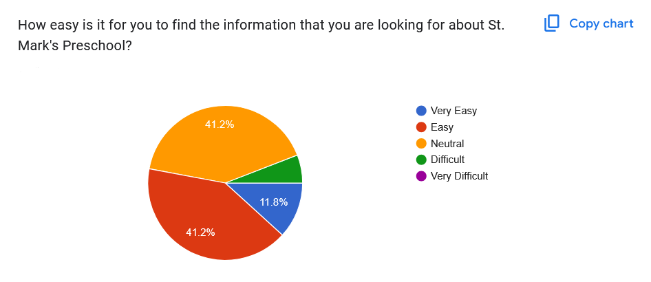
Quantitative Data regarding Navigation
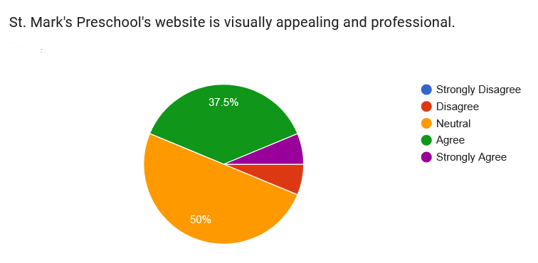
Quantitative Data regarding Aesthetics
Original Site Design
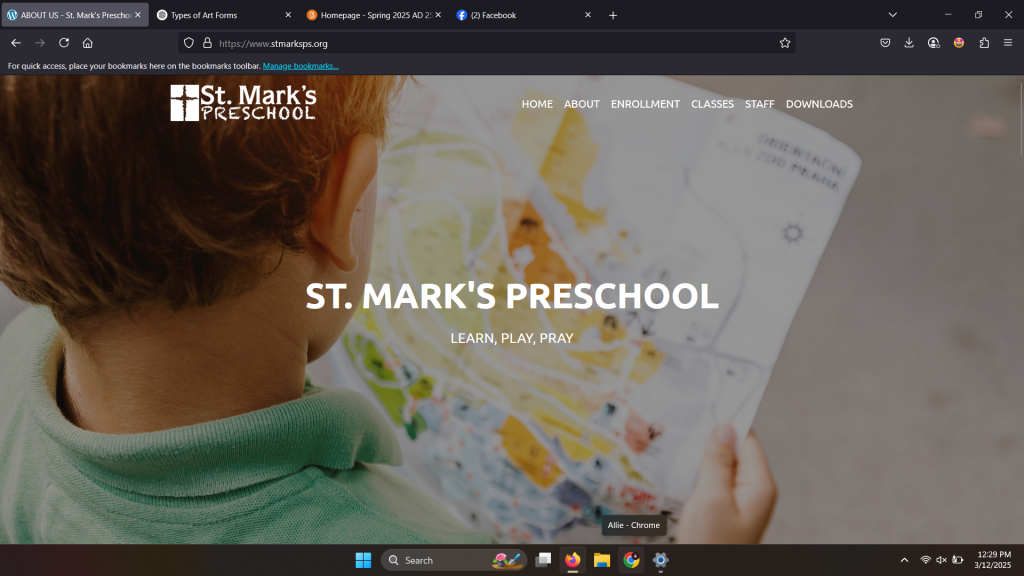
Original St. Mark’s Homepage

St. Mark’s About Information

2024-2025 Classroom Information

2025-2026 Enrollment Information

St. Mark’s Staff Information

St. Mark’s Links and Footer
Problems Identified in Original Site Design
- Single-page navigation made information hard to locate
- Staff information and social links were disorganized in the footer
- Text displayed over images is cluttered and difficult to read
- Website branding does not align with classroom materials (colors, fonts, and logos)
Development
Sitemap
We organized the site into four main categories:
- Research – Information potential parents are looking for when comparing local preschools
- Enrollment – Forms and payment for future students
- Day-to-Day – Information that currently enrolled families
- Aesthetics – Visual cues and branding
This structure guided our preliminary sketches and informed page layouts to ensure information was logically grouped and easy to access.
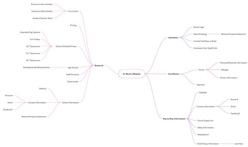
Information Organized in Potential Sitemap
Preliminary Sketches
Referencing our site map, we sketched a new interface that organized content for clarity and ease of navigation
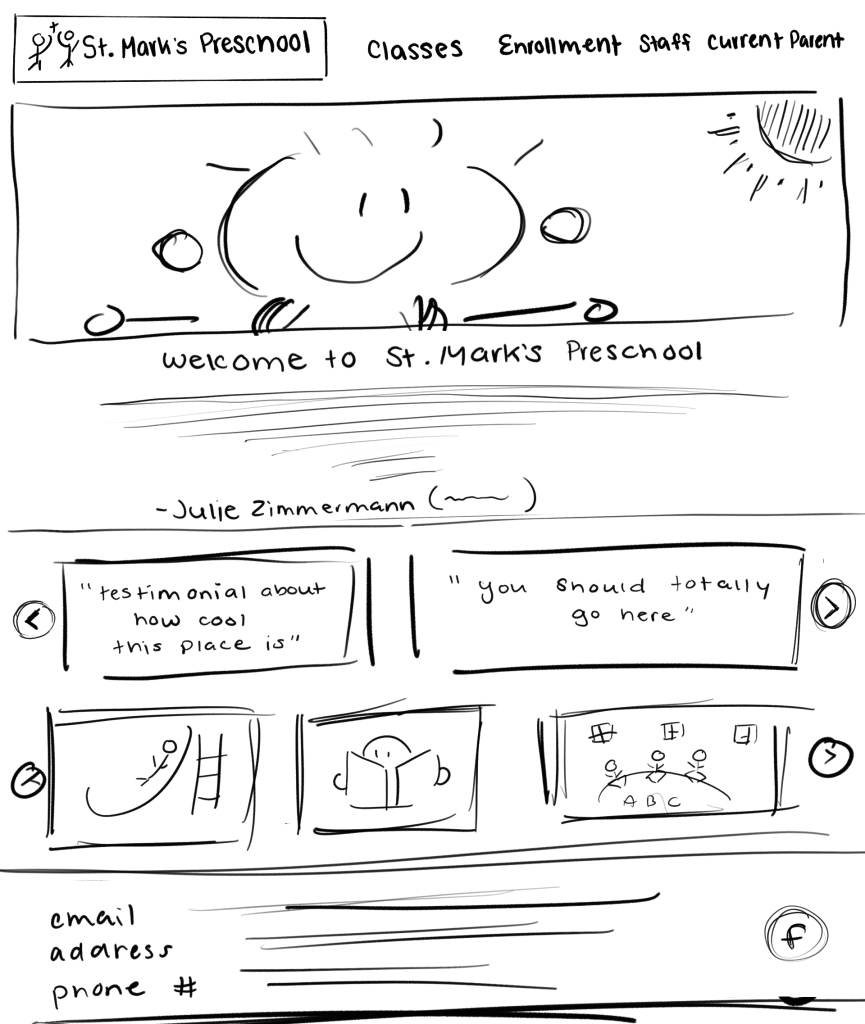
Preliminary Sketch of Homepage
Preliminary Sketch of Class Information
Branding
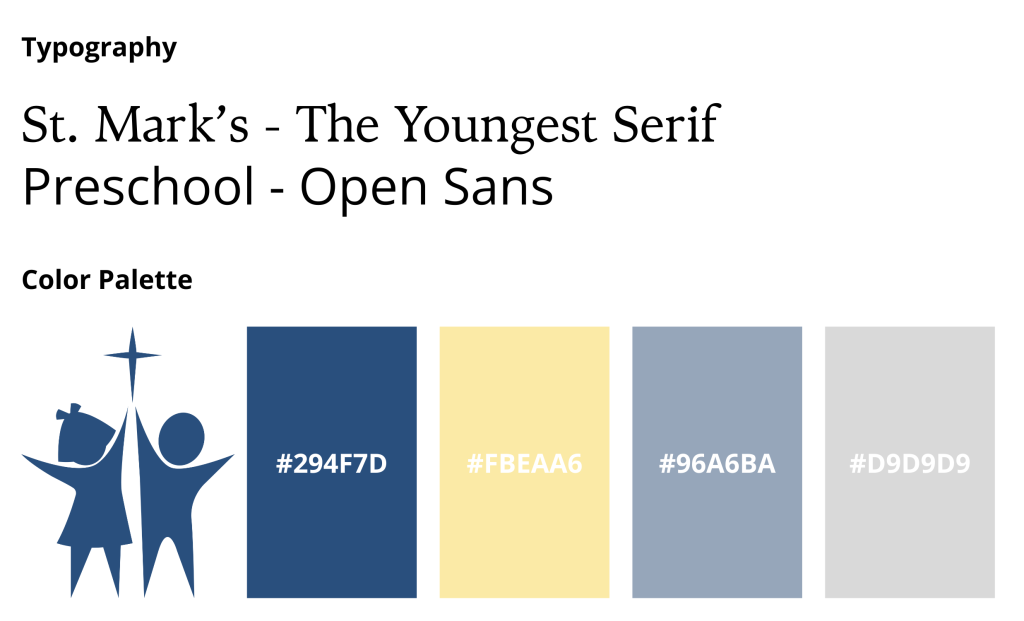
We refined St. Mark’s branding to better reflect the school’s mission. The color palette uses primary colors to highlight early learning and art, while maintaining consistency with St. Mark’s Church through a shared dark blue. Soft yellow and blue tones give the website a child-friendly identity, distinguishing it from the church.
Figma Prototype
Our high-fidelity Figma prototype emphasizes positive classroom experiences and clear access to information. The redesign prioritizes organizing information and increasing visual engagement.

St. Mark’s Homepage
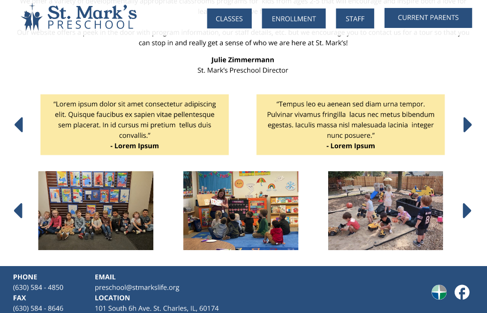
Homepage Testimonials, Photo Gallery, and Site Footer

Classroom Information and Comparisons

St. Mark’s Staff Information
Next Steps
Based on client and user feedback, we plan to implement the follow refinements before launch:
- Feature new photographs of the preschool, including new playground equipment
- Highlight school photos over parent testimonials on the homepage
- Update enrollment information for the 2025-2026 school year
Project Details
Team
- Allie Nolan
- Kaitlyn Kennedy
Team Contributions
- User research
- Flowchart
- Preliminary sketches
- Documentation
14+ weeks | January 2025 – Current