Goodreads Redesign
Goodreads reimagined for the modern reader.
Problem Space
Social media platforms bring like-minded users together. My goal is to modernize the Goodreads mobile platform and encourage collaboration between readers with a straightforward, aesthetic interface.
My Role
- Primary Research
- Project Diagrams
- Clickable Prototype
- User Testing
Proposed Solution
Overview
The redesigned interfaces streamlines navigation by minimizing the number of steps for a user to access key features. It unifies mobile and desktop experiences, ensuring consistency across platforms. New personalized reading statistics provide users with deeper insight into their reading habits and the new user-friendly design encourages interaction and engagement within the community.
This final Figma model incorporates user testing feedback to enhance usability:
- Font sizes standardized to two sizes for readability
- Home screen text simplified for clarity
- Back button added to the upper left corner for easy navigation
- Sharing icon redesigned to clearly differentiate from navigation controls
- Users can opt out of reading challenges to reduce stress
- Feature organization optimized to make options easier to find and use

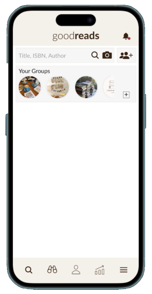
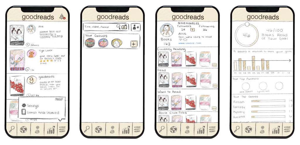
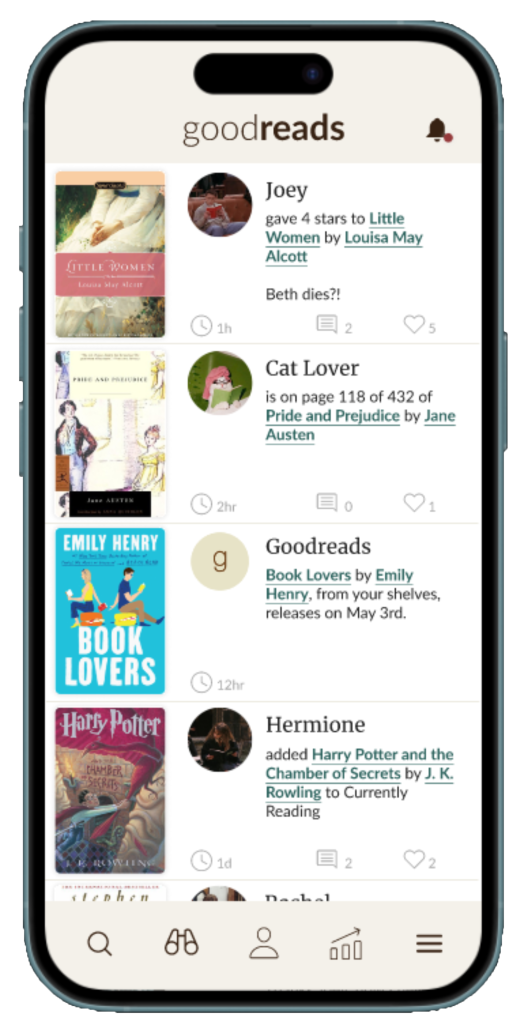
Home Screen
See updates from people you follow

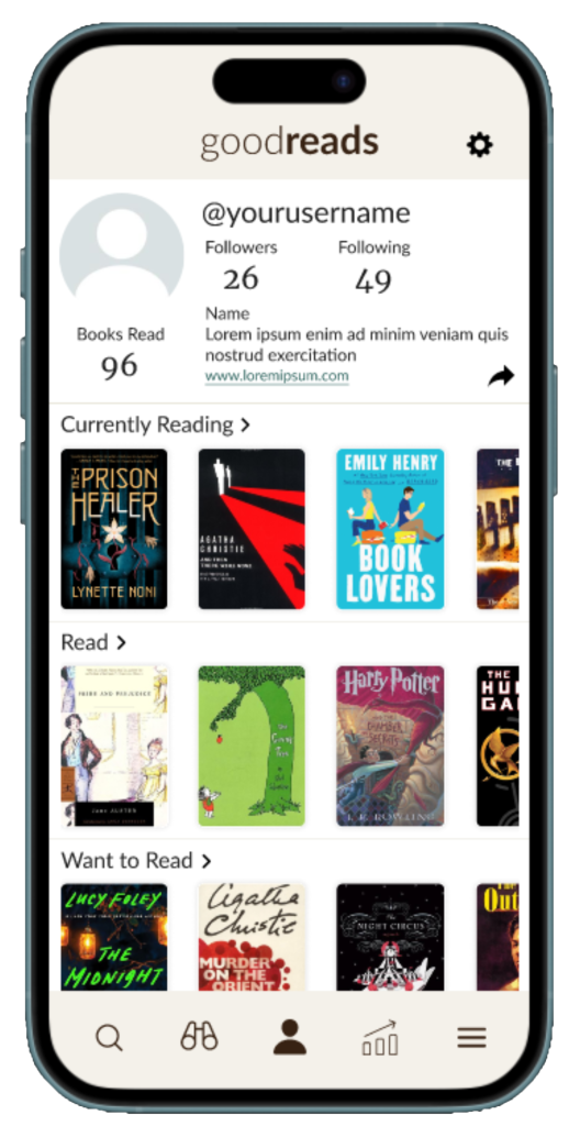
Profile
View a user’s saved books, quotes, and following information
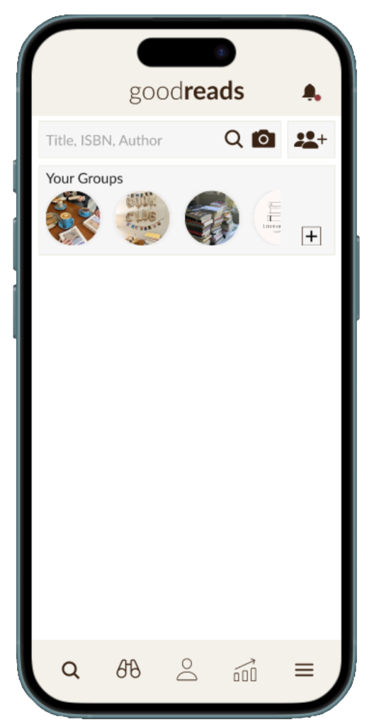
Search
Search for books, authors, users, and groups- all in one place
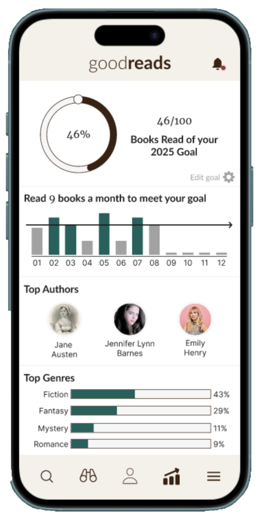
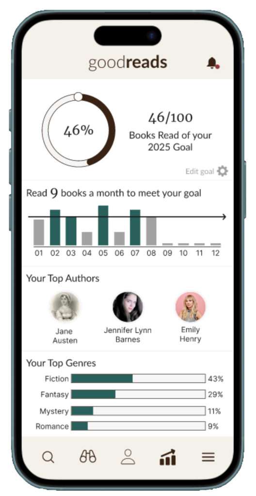
Tracker
Check your yearly reading goal and gain statistics about similarities in your books

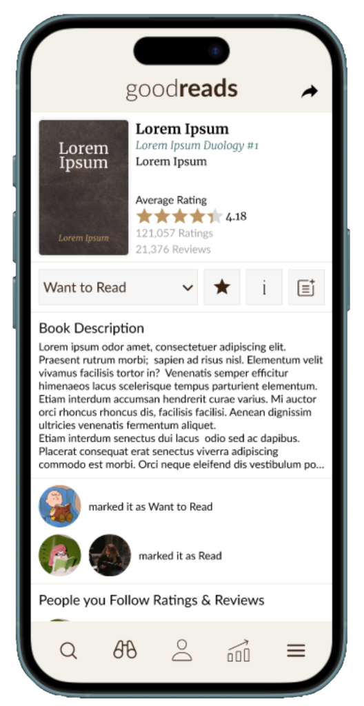
Book Information
Learn more about a book, add it to your shelves, or leave a review

Groups
All your group’s interactions in one place
Clickable Prototype created in Figma
Research
Process & Activities
- Analyzing Original Interface
- Primary Research
- Affinity Diagram
- Secondary Research
Goals
- Understand what statistics readers are interested in
- Identify areas of improvement in current interface
Original Interface


Problems Identified in Existing UI
- Multiple options are hidden behind several clicks, making it difficult for users to access and discover features
- Interface focuses on individual books and shelves, limiting opportunities to connect with other readers
Primary Research
I conducted a survey to understand how current users navigate Goodreads, interact with others, and track their reading productivity. Key findings:
- Mobile and desktop experiences are inconsistent, which leads mobile users to feel they have limited access to features
- Users want personalized statistics and insights about their reading habits
- Users want more ways to evaluate the books they read, providing richer feedback and recommendations aligned with their interests
Secondary Research
To inform design decisions, I researched social platforms and productivity apps:
- Productivity goals are most effective when specific, measurable, and time-bound.
- Feedback should be provided alongside collected data for increased productivity

Affinity Diagram of User Feedback from Preliminary Research
Development
Sitemap
To understand the organization of the redesigned app, I created a sitemap that mapped out navigation and page accessibility from the home screen. This process allowed me to organize features into their most relevant pages, ensuring a logical and user-friendly layout. This sitemap also served as a reference during the sketching phase, providing a clear overview of how Goodreads’ features interact with each other.
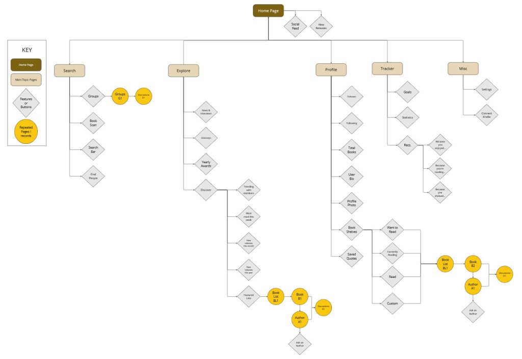
Sitemap created in Miro
Preliminary Sketches
Referencing the information from my flowchart and primary research, I developed preliminary sketches of the interface. My focus was on simplifying navigation. I prioritized making key features easily accessible rather than burying them in tabs or menus. The redesigned interface maintains the original brand aesthetic, while increasing the size of the graphics and minimizing the amount of on-screen text.
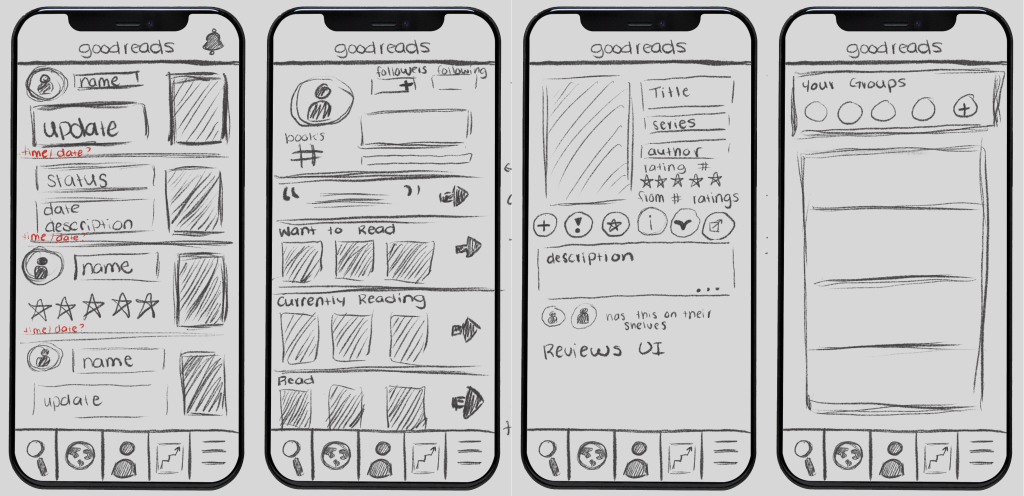
Four of my Preliminary Sketches
Secondary Sketches
In the secondary sketches, I refined early concepts by emphasizing left-to-right organization. This approach aligns with natural reading patterns, making the interface more intuitive. Key information is placed on the left side of the screen to engage users. I also considered how information should be presented to the user by asking myself how many features can be presented on screen without being overwhelming.
Four of my Secondary Sketches
Prototyping
Initial Figma Prototype
Using my sitemap and sketches, I developed a high-fidelity mock-up of the redesigned Goodreads interface in Figma.
Home Screen
Profile
Search
Tracker
Book Information

Discover
Clickable Prototype created in Figma
User Testing
Using the Figma prototype, I conducted user testing to further refine the designer. Based on the feedback that I received from my survey, users wanted:
- A back button to easily return to previous pages
- A way to reduce pressure by opting out of reading challenges
- Easier access to select features in the app
- Improvements to the font aesthetics
To organize the feedback that I received from users, I created a priority matrix. Changes were organized into four categories, Important & Urgent, Important & Not Urgent, Not Important & Urgent, and Not Important & Not Urgent. This matrix guided which features needed updates in the final Figma prototype
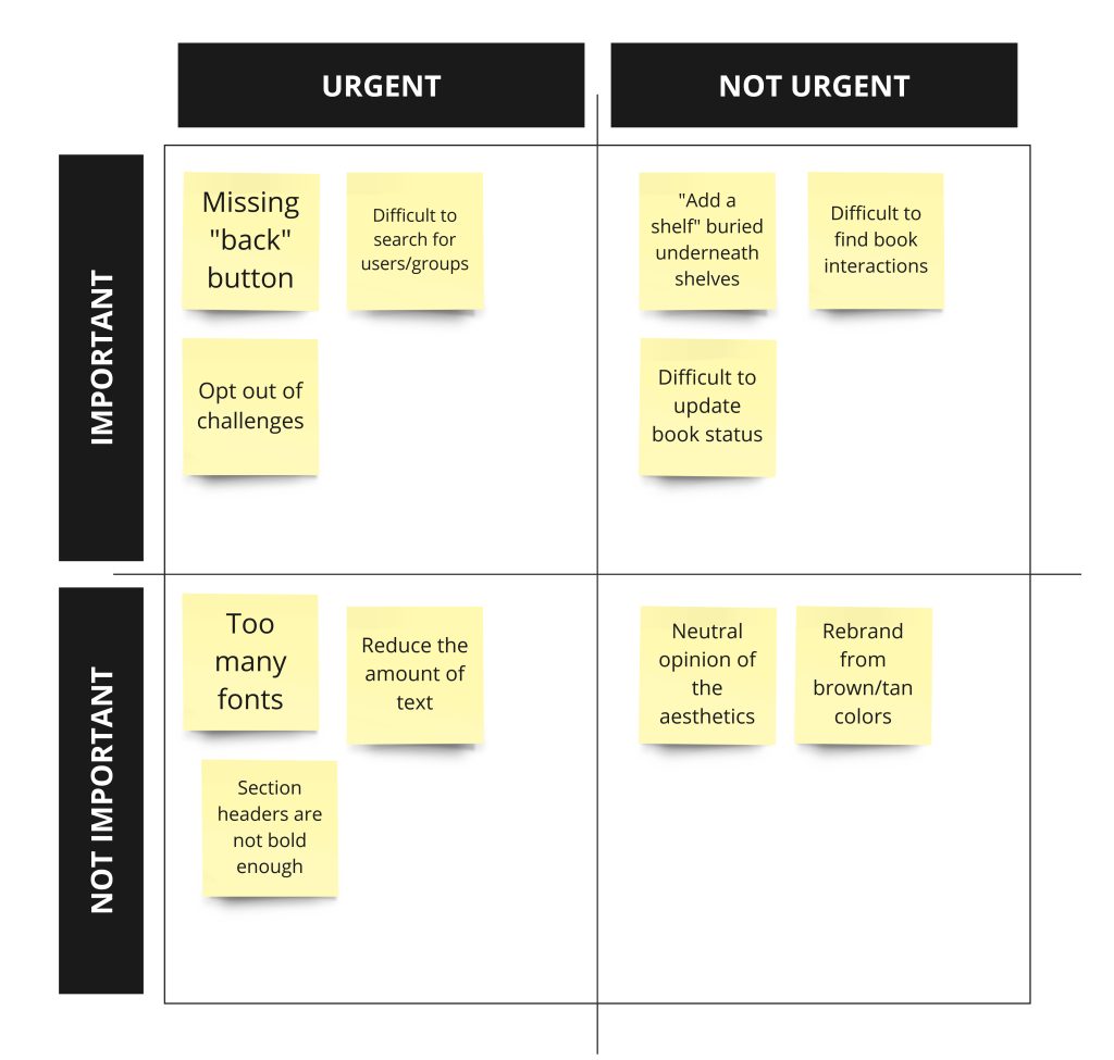
Feedback Priority Matrix